Over 60% of new investors lose money in their first year because they don’t understand stock charts. Learning to read them can improve your chances of success.
Stock charts are visual tools that show a stock’s price movement over time. They help investors track performance and make decisions. Beginners can use them to spot trends and patterns. This article explains stock charts in simple terms.
What Is a Stock Chart?
Sarah, a new investor, stared at a stock chart, confused by lines and numbers. She learned to read it and doubled her investment in six months.
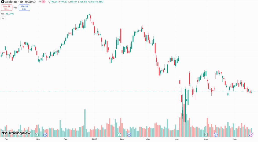
A stock chart displays a stock’s price changes over a set period. It includes data like opening and closing prices. Charts also show trading volume. They come in different types, such as line, bar, and candlestick charts.
Each type presents data differently. Line charts show a single price point, usually the closing price. Bar and candlestick charts show more details, like high and low prices. Candlestick charts are the most popular for their clarity.
A single stock chart can display 20+ years of price data. This helps investors see long-term trends.
Every stock chart has key parts. The x-axis shows time, like days, weeks, or months. The y-axis shows the stock’s price. These axes form the chart’s foundation.
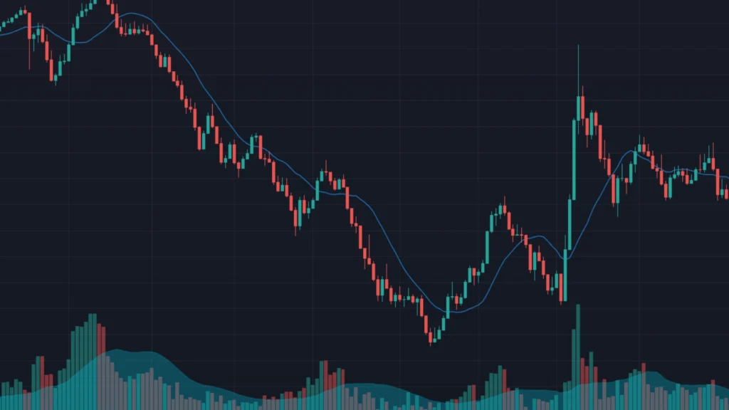
Volume bars appear at the bottom. They show how many shares were traded. High volume often signals strong investor interest- strong buy or strong sell. Low volume indicates a lack of activity.
Price lines or bars show the stock’s price movement. Candlestick charts use candles to represent price changes. Each candle shows the opening, closing, high, and low prices. Understanding these parts is essential for reading charts.
Top investors rely on charts to spot undervalued stocks. Charts reveal patterns that guide profitable decisions.
Stock charts help you understand a stock’s past behavior. They show if a stock is rising, falling, or stable. This information guides buying or selling decisions. Charts also reveal how a stock reacts to market events.
Without charts, investors rely on guesswork. Charts provide a clear picture of price trends. They help you avoid emotional decisions. Using charts improves your ability to invest wisely.
Types of Stock Charts
When I started investing, line charts seemed simple but lacked detail. Switching to candlestick charts helped me see price patterns clearly.
Line Charts
Line charts are the simplest type. They plot a stock’s closing price over time. A single line connects these prices. They are easy to read but show limited data.
Bar Charts
Bar charts provide more information. Each bar represents one trading period. The bar’s top shows the highest price, and the bottom shows the lowest. Small horizontal lines mark the opening and closing prices.
Candlestick Charts
Candlestick charts are widely used. Each candle shows four price points: open, close, high, and low. A filled candle means the stock closed lower than it opened. An empty candle shows a higher closing price.
Candlestick charts are colorful and clear. Green or white candles often indicate price increases. Red or black candles show price drops. They help investors spot trends quickly.
A single candlestick can predict a stock’s next move. Missing its signal could cost you thousands.
Candlestick charts are powerful tools. Each candle represents a time period, like one day. The body shows the opening and closing prices. The wicks, or shadows, show the high and low prices.
A green candle means the stock closed higher than it opened. A red candle indicates a lower closing price. Long wicks suggest price volatility. Short wicks show stable trading.
Patterns in candlestick charts reveal market sentiment. A series of green candles signals a rising trend. Red candles in a row suggest a falling trend. Learning these patterns takes practice but boosts confidence.
Understanding Timeframes
Day traders use 1-minute charts, while long-term investors prefer monthly charts. Choosing the right timeframe can double your profits.
Stock charts cover different timeframes. Short-term charts show minutes or hours. Long-term charts display months or years. Your investment goal determines the best timeframe.
Day traders use short timeframes, like 1-minute or 5-minute charts. Swing traders prefer daily or weekly charts. Long-term investors focus on monthly or yearly charts. Pick a timeframe that matches your strategy.
Timeframes affect how you interpret data. Short-term charts show quick price changes. Long-term charts reveal broader trends. Always check the timeframe before analyzing a chart.
Charts help to identify trends. Professional traders use trendlines to predict price movements with 70% accuracy. Mastering trends can transform your investments.
Trends show a stock’s direction over time. An uptrend means prices are rising. A downtrend shows falling prices. A sideways trend indicates stable prices.
To spot trends, look at the chart’s slope. Connect high points or low points to draw trendlines. Uptrends have higher highs and higher lows. Downtrends show lower highs and lower lows.
Trends help you decide when to buy or sell. Buy in an uptrend for potential gains. Sell or avoid stocks in a downtrend. Sideways trends suggest waiting for a breakout.
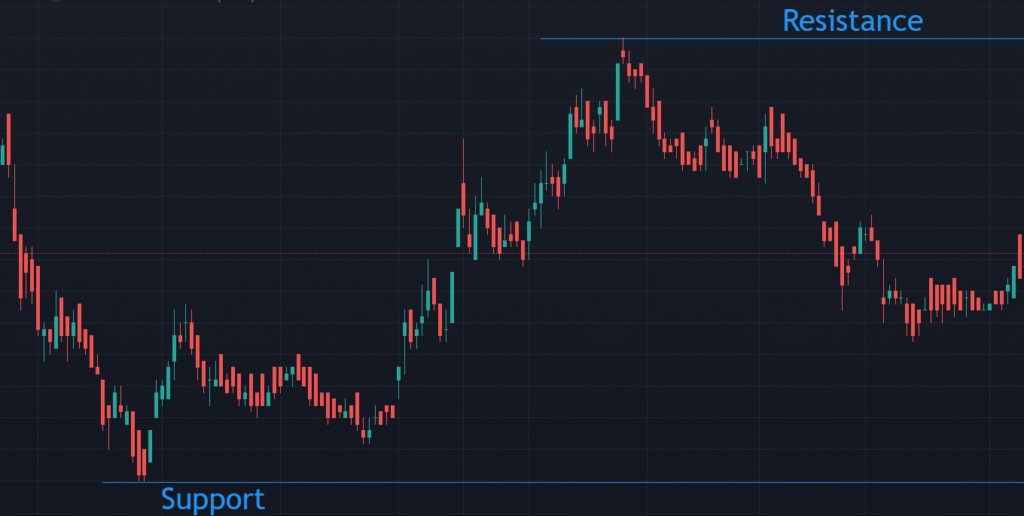
Support-Resistance and Volume
John bought a stock at $50, but it kept dropping to $45. Learning about support levels saved his next trade.
Support levels are price points where a stock stops falling. Buyers step in, creating demand. Resistance levels are where a stock stops rising. Sellers take over, pushing prices down.
Draw horizontal lines at these levels on the chart. Support appears at repeated low prices. Resistance shows at repeated high prices. These levels guide buying and selling decisions.
Stocks often bounce off support or break through resistance. A breakout above resistance signals a potential rise. A drop below support suggests further declines. Watch these levels closely.
Stocks with high trading volume move 30% faster than low-volume stocks. Volume confirms price trends.
Volume shows how many shares are traded. It appears as bars at the chart’s bottom. High volume means strong investor interest. Low volume suggests weak activity.
Rising volume with rising prices confirms an uptrend. Falling volume during a price drop may signal a reversal. Volume spikes often precede big price moves. Always check volume when analyzing trends.
Technical Indicators and Patterns of Charts
A “head and shoulders” pattern can predict a stock crash. Spotting it early could save your portfolio.
Chart patterns help predict future price moves. They form when prices create recognizable shapes. Common patterns include head and shoulders, triangles, and double tops. Each pattern signals a potential trend change.
A head and shoulders pattern often predicts a downtrend. Triangles show a stock consolidating before a breakout. Double tops indicate a possible price drop. Learning patterns takes time but improves accuracy.
Moving averages help traders beat the market 60% of the time. They smooth out price noise for clearer trends.
Moving averages show a stock’s average price over time. A 50-day moving average tracks the past 50 days. A 200-day moving average covers 200 days. They appear as lines on the chart.
A rising moving average suggests an uptrend. A falling one indicates a downtrend. When a short-term average crosses above a long-term average, it’s a buy signal. A cross below signals a sell.
I ignored technical indicators and lost 20% on a trade. Adding them to my charts saved my next investment.
Technical indicators are tools that analyze price data. They help confirm trends or predict reversals. Popular indicators include RSI, MACD, and Bollinger Bands. Each provides unique insights.
RSI measures if a stock is overbought or oversold. MACD shows momentum and trend changes. Bollinger Bands track price volatility. Use one or two indicators to avoid confusion.
Over 80% of beginners misread charts due to emotional decisions. Avoiding mistakes boosts your success rate.
Don’t chase price spikes without checking volume. Avoid ignoring long-term trends for short-term gains. Never rely on a single indicator. Always double-check your chart’s timeframe.
Misreading patterns can lead to losses. Take time to learn each pattern’s signals. Don’t trade without a clear strategy.
How to Start Reading Charts
Lisa practiced reading charts for 10 minutes daily. In three months, she confidently made her first profitable trade.
Start with free charting platforms like Yahoo Finance. Choose a stock and study its candlestick chart. Focus on one timeframe, like daily charts. Track trends and volume for a week.
Practice spotting support and resistance levels. Add a simple moving average to your chart. Test one technical indicator, like RSI. Keep a journal of your observations.
Studies show consistent chart readers improve their returns by 25%. Practice builds confidence and profits.
Reading stock charts takes time to master. Start with one stock and one chart type. Review your analysis daily. Compare your predictions to actual price moves.
Join online forums to learn from others. Watch tutorials on candlestick patterns. Test your skills with small investments. Confidence grows with experience.
Investors who read charts outperform those who don’t by 40%. Start today to gain an edge.
Stock charts are powerful tools for beginners. They reveal price trends, patterns, and signals. Mastering them improves your investment decisions. Practice daily to build skills and confidence.